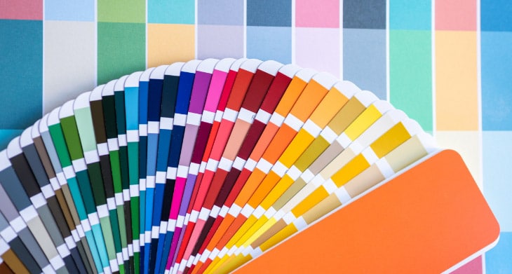
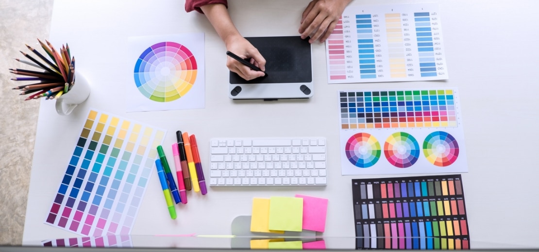
Have you ever thought about the impact of colors on the User Interface? Knowing how to use the right color is essential not only for aesthetic purposes but also for improving User Experience by simplifying navigation throughout your mobile app. Using a specific color palette consumers can get an idea of the purpose of your app at first sight.
Social media apps for instance use mostly bright and vibrant colors. On the other hand, if you are creating a mind and body app, the colors would be completely different, usually neutral. A great designer would know how to use colors in the best way so that users understand the idea and purpose of a mobile app right away.
Using psychology often works for gaining more success among your competitors. Colors play a huge role in how the brain perceives provided information and functionality. The way each of them affects users needs to be considered when developing a customer-oriented mobile app design.
A common example when we talk about colors is Facebook. Mark Zuckerburg is actually red-green colorblind and blue seemed to be his best choice which he can see. In fact, blue also gives a feeling of trust. It stands for communication and efficiency. All the things you’d want from social media, right. A number of experts even think that part of the success of Facebook is because of the use of a perfect color palette for such a platform.
Why is color psychology that important for mobile app design?

Simply said color psychology is the study of colors and how they influence human behavior. Its primary colors are red, yellow, green and blue. Each of them has different effects on human emotions and perception.
Color is an essential part of the user-friendly interface. A great example is the app icon. It’s the first thing users see and get an impression of, so you’d like it to be the right one and make them actually check out your app. Different colors generate specific human behavior. Using them in the right way can lead to a higher number of downloads and way more engaged consumers.
According to a study, 92,6% of people claim that the visual dimension is the most important influencing factor affecting their purchase decision. Two out of three consumers aren’t willing to buy a large appliance if it’s not in their preferred color.
- Security and trust: Blue was the most common choice (28%; 34%) Remember the Facebook example?
- Speed: Red — a definite favorite (76%)
- Cheapness: Orange and yellow get very close results (26%; 22%)
- High Quality: Black got 43% and opposite to the last point orange got 0%, which connects the cheap product with low quality in people’s minds.
- High technology: Again Black and Blue got the highest results (26%; 23%) as well as gray which got the same score as blue
- Reliability: Blue leads with 43%
- Fun: Orange and yellow were top choices here as well (28%; 26%)
In a survey, people were asked to associate a color with particular words. Here are the results:
Having this information you can choose the best color palette that fits the purposes of your app and the emotion you want it to generate in people’s minds.
How to find the right color scheme for your mobile app?

With the endless choice of colors, there is, it probably seems impossible for you to find the right color scheme for your mobile app design. Color won’t affect only its outlook, but also the marketing and your brand. Knowing that color comes right after functionality to your app, you need to make sure you choose it according to the idea and your brand.
The right color combination will make your app easier to use and more appealing. However, keep in mind that people prefer simple color schemes that use no more than 3 colors. There are now existing color schemes that you can choose from. Colors can be used in a way that they complement each other.
Think about what impression do you want your app to leave in people. If it’s entertaining you’d most likely go for warm tones if it’s e-commerce you can choose cooler, blue or even gray-scaled scheme, as it would make it more reliable to users.
How to find the right color scheme for your mobile app?
We’ve already mentioned that the right color can boost your conversion rate. Let’s now dive a little deeper. Can you actually use color psychology to make people click on that “buy” button?
Things that are easy to use, are easy to sell
This research shows which are the most popular choices of color for add to cart buttons. Red seems to be the most used, followed by green, blue and orange. That’s because red buttons result way more clicks.

This so doesn’t mean that you add to cart button has to be red. Always examine your audience and their psychology. It’s what can help you most when choosing your mobile app’s color scheme. Be aware of what your users like and which color they are most willing to click on. What you need to be sure of in all cases is that your buy button stands out and is easily accessible on your page.
There is no universal color that will skyrocket any app and website’s sales. However, if you follow the color psychology rules you can use a certain color to your advantage. It’s also appropriate to consider the different web design trends which are currently shaping the landscape. This will help you even more when implementing the right color scheme on your website or mobile app.
Easy solutions are complex to develop
Final Thoughts
Now you know why colors are so important to your mobile app design. Use their power to make a successful one that can easily engage users. It’s crucial to get feedback from your target market before the design process has begun.
The right choice of the color scheme provides the consumer of your mobile app with an amazing visual experience. This can be a great competitive advantage over similar apps. Choose colors suitable for the purpose of your mobile app and your user base. Don’t use more than three colors, because this would make it less attractive. Remember: simplicity is key.
Read Similar Blogs


Subscribe Blog Metro to Get Newest Update
It is a long established fact that a reader will be distracted by the readable content of a page when looking at its layout.


